Skip to content
Nosce Te Ipsum
  • Home
  • About me
  • My COETAIL Blogs
    • Course 1
    • Course 2
    • Course 3
    • Course 4
  • Testimonials
    • Professional
    • Personal
Site Search

Simple, Appealing and Effective

  • March 14, 2015
  • by Muhammad
Share on Facebook
Facebook
Tweet about this on Twitter
Twitter
Share on LinkedIn
Linkedin
Pin on Pinterest
Pinterest
Share on Reddit
Reddit
Email this to someone
email
Share on StumbleUpon
StumbleUpon
Digg this
Digg

Infographics are all that and more. They have also come a long way from 1626 when they are thought to have been invented but today’s technology has made them a very attractive way of putting a lot of information and data on one single sided piece of paper though sometimes we do need a rather large size of paper to have the text legible.

During the academic year I am called upon to explain Internet and its workings to students, specially in high school and I always find it useful to work with infographics as I have limited time and a lot of information to pass on. One of the infographic I would use is global Internet traffic maps similar to the one below:

Photo Credit: NetMapper via Compfight cc

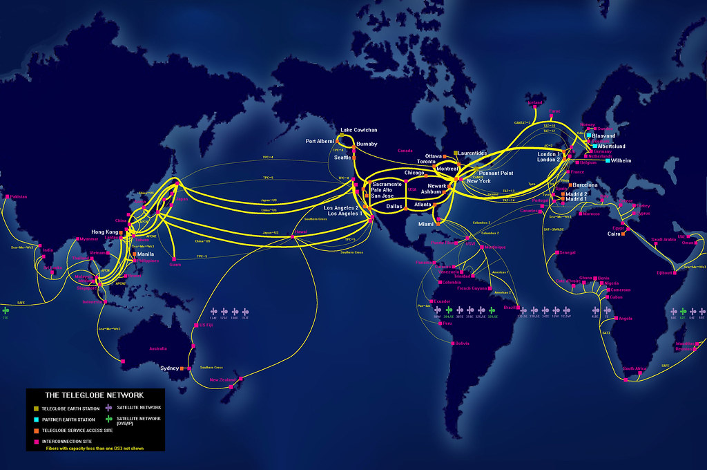
I always find it interesting that very few of the students actually understand how the data flows through the Internet and this image puts the perspective right in front of them! From then onwards it is easier for me to go through the inner workings and principles of  Internet traffic and the way our experiences are dependant on a vast number of factors.

True to the focus of this course I always have to add more information in terms of content which uses various other forms of visual literacy and I always find that this video from ‘Data Centers Canada’ explains it so well in about five minutes.

The resulting curiosity and questions as well as understanding automatically leads to a meaningful fulfilment of the purpose of my tiny contribution to learner’s journey of knowledge.

If you also have to explain the workings of Internet to your students you may want to use the wonderful app developed by Peer 1 Hosting and available to download for iOS and Android devices. It puts the 3D spin on visualising Internet in a mind boggling way. I love to show this to students.

Share on Facebook
Facebook
Tweet about this on Twitter
Twitter
Share on LinkedIn
Linkedin
Pin on Pinterest
Pinterest
Share on Reddit
Reddit
Email this to someone
email
Share on StumbleUpon
StumbleUpon
Digg this
Digg
1001 Nights
Final Project
Muhammad
global internet infographics internet internet traffic

Related articles

Final Project
1001 Nights
From “Death” by PowerPoint to…
Images, Images, Images
Visual Literacy: Why we need…
1 COMMENT
  • Kim Cofino
    March 20, 2015 at 14:31

    Love this! Such great resources for students to understand how the internet works! Thanks for sharing these!

Leave a Reply Cancel reply

Your email address will not be published. Required fields are marked *

This site uses Akismet to reduce spam. Learn how your comment data is processed.

Follow Me!

Follow Me On TwitterFollow Me On LinkedInFollow Me On PinterestFollow Me On About.meFollow Me On Wordpress
May 2025
M T W T F S S
« Oct    
 1234
567891011
12131415161718
19202122232425
262728293031  

2009 2010 2011 Amelie apache beijing birthday clearos crèpes debian december 2009 dubai email february firewall guide holidays ill install internet kuala lumpur linux list mac maheen mobile october 2009 outlook Pakistan raspberry raspberry pi router search Sharepoint smtp snow spring ubuntu unix VLAN VPN windows 7 winter xian Zimbra

WP Cumulus Flash tag cloud by Roy Tanck requires Flash Player 9 or better.

Categories

Licensed under a Creative Commons Attribution-NonCommercial-NoDerivs 3.0 Unported License.
Theme by Colorlib Powered by WordPress
  • Home
  • About me
  • My COETAIL Blogs
  • Testimonials